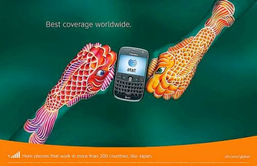
Recently a colleague of mine sent me a link to her favourite advertising campaign of all time. I am very thankful that she shared it with me, as they are absolutely amazing. I can see why these advertisements stood out and were so memorable. After viewing them I would have to say that they are the most artistic creative advertising print campaign I’ve come across yet. Their intricate detail and bright colours make them both eye catching and intriguing.
AT&T‘s
“hands” campaign was launched in 2008 in the United States and was created by
the advertising agency BBDO (AT&T, 2015, para. 3-4). Each print
advertisement features a set of hands painted to represent different countries
of the world. Guido Daniele, a famous Italian artist, is responsible for
painting the hands in each of the print advertisements (AT&T, 2015, para.
4).
 |
| (Image Connect, n.d.) |
 |
| (Image Connect, n.d.) |
 |
| (Image Connect, n.d.) |
 |
| (Image Connect, n.d.) |
 |
| (Image Connect, n.d.) |
 |
| (Image Connect, n.d.) |
 |
| (Image Connect, n.d.) |
 |
| (Image Connect, n.d.) |
 |
| (Image Connect, n.d.) |
 |
| (Image Connect, n.d.) |
 |
| (Image Connect, n.d.) |
 |
| (Image Connect, n.d.) |
 |
| (Image Connect, n.d.) |
 |
| (Image Connect, n.d.) |
 |
| (Image Connect, n.d.) |
 |
| (Image Connect, n.d.) |
 |
| (Image Connect, n.d.) |
 |
| (Image Connect, n.d.) |
 |
| (Image Connect, n.d.) |
 |
| (Image Connect, n.d.) |
 |
| (Image Connect, n.d.) |
 |
| (Image Connect, n.d.) |
The idea of
using hands painted to represent the different countries AT&T’s
international wireless service is brilliant. The advertising message is clear
and the copy is simple, informative and to the point. The details are so
artistic and intricate, I find them to be more like art then advertisements. I
could imagine them on display in an art museum. The bright colours chosen for the hand paintings really accentuate the imagery, making them stand out.
In most of the advertisements I find the imagery overpowers the product. Although
there is an AT&T cellphone in each advertisement and in the majority of the
advertisements it is placed in the centre of the advertisement, the surrounding imagery of
the painted hands is the first thing I see when I view them. The more I look at
them, the easier it is to forget the paintings are made on actual human hands.
It incredible to think that our hands can be shaped to form so many
recognizable shapes and images.
Do you think the AT&T “Hands”
print advertisements are creative? Which of the twenty-two AT&T “Hands”
campaign print ads are your favourite?
References:
AT&T.
(2015). AT&T “Hands” Advertising
Campaign Voted “America’s Favorite Magazine Ad” by Consumers. Retrieved
from http://www.att.com/gen/press-room?pid=4800&cdvn=news&newsarticleid=26908
Image
Connect. (n.d.). AT&T Hands Campaign [Image].
Retrieved from http://www.promotional-product-solutions.com/ATT_Hands_Ads.html


No comments:
Post a Comment