Sunday, March 15, 2015

The Most Creative Viral Advertising Campaign

The creative advertisement campaign I want to share with you this week, is one of my all-time favourite advertisements. My boyfriend shared it with me last summer. I have watched it multiple times and I still find it as funny as the first time I viewed it.

The cat food company Friskies launched an advertising campaign entitled “Dear Kitten” in June 2014 which was created by the social media company BuzzFeed (Viral Viral Videos, 2014a). It was launched online and was viewed on YouTube (Powell, 2014).

I’m not a cat person, but this commerical makes me want to buy a kitten and feed it Friskies cat food.

Check out the below three YouTube videos which showcase part of the series of viral “Dear Kitten” Friskies advertisements posted by BuzzFeedVideo.
 

https://www.youtube.com/watch?v=G4Sn91t1V4g
(BuzzFeedVideo, 2014 June 5)


https://www.youtube.com/watch?v=aBrSvHPY1NQ
(BuzzFeedVideo, 2015 January 22)

https://www.youtube.com/watch?v=3yNSF7ljOoU
(BuzzFeedVideo, 2014 October 7)

Check out the below three YouTube videos which showcase part of the series of viral “Dear Kitten” Friskies advertisements posted by Purina Friskies.
 

https://www.youtube.com/watch?v=aZ9kSMmetd0
(Purina Friskies, 2014a October 7)


https://www.youtube.com/watch?v=CrnIZXGU1mU
(Purina Friskies, 2014b October 7)


https://www.youtube.com/watch?v=C1194saQTa8
(Purina Friskies, 2015 January 22)
 
Each advertisement is about an older cat educating a new kitten about the ways of surviving life in the house. Each advertisement talks about a different household situation. It really shows us the world through the eyes of a cat. I think these advertisements are both brilliant and hilarious. The script is very well written. I think they did a really good job at filming the relationship between the cats. The advertisement is for Friskies wet cat food. I will admit the first time I watched the commercial “Dear Kitten” I did not know what they were selling until half way through the commerical. I like the way they introduce the product half way through each commerical and then end with a full product demonstration.
The first advertisement from the campaign they launched entitled “Dear Kitten” is my favourite. I love the persona they gave the older cat. I love the very first line “since I have hissed at you the customary 437 times” and the reference about the evil “vacuuum.” I have witnessed my boyfriend’s cat run and hide from the vacuum like it’s a monster out to get him.
 
Do you find the “Dear Kitten” campaign to be incredibly creative? Do you also find it funny and memorable? Was the first advertisement entitled “Dear Kitten” you favourite as well?


References:
BuzzFeedVideo. (2014, June 5). Dear Kitten [Video file]. Retrieved from https://www.youtube.com/watch?v=G4Sn91t1V4g

BuzzFeedVideo. (2015, January 22). Dear Kitten: Regarding The Big Game [Video file]. Retrieved from https://www.youtube.com/watch?v=aBrSvHPY1NQ

BuzzFeedVideo. (2014, October 7). Dear Kitten: Regarding The Dog [Video file]. Retrieved from https://www.youtube.com/watch?v=3yNSF7ljOoU

Castillo, M. (2015, January 22). BuzzFeed Creates Its First TV Ad, and of Course It Features Cats Friskies’ series “Dear Kitten” will air during Super Bowl in 3 regional markets. Retrieved from http://www.adweek.com/news/advertising-branding/buzzfeed-creates-its-first-tv-ad-and-course-it-features-cats-162467

Powell, V. (2014, June 10). Friskies Dear Kitten: Everybody Loves This Commerical. Retrieved from http://www.webpronews.com/friskies-dear-kitten-everybody-loves-this-commercial-2014-06

Purina Friskies. (2014b, October 7). Dear Kitten: Impersona-cat [Video file]. Retrieved from https://www.youtube.com/watch?v=CrnIZXGU1mU

Purina Friskies. (2014a, October 7). Dear Kitten: My Friend Peanut [Video file]. Retrieved from https://www.youtube.com/watch?v=aZ9kSMmetd0

Purina Friskies. (2015, January 22). Dear Kitten: The Disappearing Humans – Purina@Friskies [Video file]. Retrieved from https://www.youtube.com/watch?v=C1194saQTa8

Viral Videos. (2014a, June 5). Dear Kitten. Retrieved from http://www.viralviralvideos.com/2014/06/05/dear-kitten/

Viral Viral Videos. (2014b, October 7). Older Cat Explains To Kitten About The New Dog. Retrieved from http://www.viralviralvideos.com/2014/10/07/older-cat-explains-to-kitten-about-the-new-dog/

Sunday, March 8, 2015

A Shockingly Creative Advertising PSA Campaign

Shortly after I published my last blog post, a friend of mine sent me a link to a public service announcement campaign that they said really stood out for them. After viewing the first print advertisement it was easy to see why they stood out.

The public service announcement entitled “Meth – Not even once” was created by the advertising agency Venables Bell & Partners for the Meth Project Foundation (part of The Partnership for Drug-Free Kids) in 2005-2012 (Adforum, 2013, para. 1). The Meth Project Foundation is part of The Partnership for Drug-Free Kids (Meth Project Foundation, 2015b, para. 1).

Each advertisement focuses on the negative aspects of trying meth for the first time. They draw attention to how using the drug meth changes a person’s life, by showing some of the dangerous situations meth users find themselves in.

Check out the below print advertisements that were created for the Meth Project Foundation campaign entitled “Meth – Not even once.”


Creative, Advertising, Meth, Meth Project Foundation, Not even once, PSA, Campaign, Public Service Announcement
(Meth Project Foundation, 2015a)
 
Creative, Advertising, Meth, Meth Project Foundation, Not even once, PSA, Campaign, Public Service Announcement
(Meth Project Foundation, 2015a)
 
Creative, Advertising, Meth, Meth Project Foundation, Not even once, PSA, Campaign, Public Service Announcement
(Sohail, 2013)
 
Creative, Advertising, Meth, Meth Project Foundation, Not even once, PSA, Campaign, Public Service Announcement
(Sohail, 2013)
 
Creative, Advertising, Meth, Meth Project Foundation, Not even once, PSA, Campaign, Public Service Announcement
(BuzzFeed, 2013)
 
Creative, Advertising, Meth, Meth Project Foundation, Not even once, PSA, Campaign, Public Service Announcement
(Meth Project Foundation, 2015a)
 
Creative, Advertising, Meth, Meth Project Foundation, Not even once, PSA, Campaign, Public Service Announcement
(BuzzFeed, 2013)
 
Creative, Advertising, Meth, Meth Project Foundation, Not even once, PSA, Campaign, Public Service Announcement
(BuzzFeed, 2013)
 
Creative, Advertising, Meth, Meth Project Foundation, Not even once, PSA, Campaign, Public Service Announcement
(BuzzFeed, 2013)
 
Creative, Advertising, Meth, Meth Project Foundation, Not even once, PSA, Campaign, Public Service Announcement
(BuzzFeed, 2013)
 

Check out this YouTube video compilation of some of the commercials made for the Meth Project Foundation campaign “Meth – Not Even Once” posted by David-Bernard Bujoold (Bujold, 2011 June 22).

https://www.youtube.com/watch?v=uGiAxwgrF_k


This series of public service announcement advertisements displayed a clear and concise message. Overall I found each advertisement disturbing, but in a way that they really grabbed my attention and educated me to the effects of using meth. The target is easily identified as youth. The images they used in the print advertisements were very strong and the headlines were very well written, grabbing the reader’s attention.

I think these were some of the best advertising commercials I’ve ever seen for a public service announcement. After watching one, I kept searching for others until I came across the compilation video I added above. I think the script for each commerical are very well written. I also like the sound effects they used at the end of each commerical as the organizations logo appears. They branded their advertisements very well.

I would say the Meth Project Foundation campaign “Meth – Not even once” is incredibly creative in the sense that it depicts real life situations regarding meth addicts that are very disturbing. I really like the way they pushed the envelope and showed the world through the eyes of a young meth addict.

Do you think the public service announcement Meth Project Foundation campaign “Meth - Not even once” is creative?


References:
Adforum. (2013). The Montana Meth Project. Retrieved from http://ca.adforum.com/search/creative-work/brand/The%20Montana%20Meth%20Project
BuzzFeed. (2013, August 8). METH Ads – Nothing But METH Ads. Retrieved from http://www.buzzfeed.com/copyranter/meth-ads-nothing-but-meth-ads#.pfQ9j0r77v
Meth Project Foundation. (2015a). About. Retrieved from http://www.methproject.org/about/
Meth Project Foundation. (2015b). View Ads. Retrieved from http://www.methproject.org/ads/print/brain.html
Sohail. (2013, November 27). Overview of the best social advertising against drugs (14 photos). Retrieved from http://hybridtechcar.com/overview-best-social-advertising-drugs-14-photos/
Bujold, D. (2011, June 22). Meth – Not Even Once [Video file]. Retrieved from https://www.youtube.com/watch?v=uGiAxwgrF_k


Monday, March 2, 2015

The Most Creative Advertising PSA Campaign


This year we started learning about public service announcements in my copy and layout class. While researching some of the best public service advertisements ever created, I came across an incredibly creative campaign that I cannot wait to share with you this week.

The public service announcement campaign entitled “Choose One” was created for the organization Moms Demand Action by the advertising agency Grey located in Toronto and was launched in 2013 (PR Newswire, 2013, para. 5). Each of the print advertisements in the campaign contains powerful strong imagery and direct informative body copy, which is so frank it almost seems comical.


Check out the below six print advertisements from the Moms Demand Action “Choose One” public service announcement campaign.


PSA, public service announcement, creative, advertising, campaign, print, Moms Demand Action, Choose One
(Mediabistro Inc., 2015d)
 
PSA, public service announcement, creative, advertising, campaign, print, Moms Demand Action, Choose One
(Mediabistro Inc., 2015c)
 
PSA, public service announcement, creative, advertising, campaign, print, Moms Demand Action, Choose One
(Mediabistro Inc., 2015a)


PSA, public service announcement, creative, advertising, campaign, print, Moms Demand Action, Choose One
(Mediabistro Inc., 2015b)
PSA, public service announcement, creative, advertising, campaign, print, Moms Demand Action, Choose One
(Mediabistro Inc., 2015e)
PSA, public service announcement, creative, advertising, campaign, print, Moms Demand Action, Choose One
(Mediabistro Inc., 2015f)


The advertising message in each print advertisement is clear and to the point. Each advertisement appears to be mildly comical by the frank way they chose to point out how lax some laws are regarding assult weapons in the United States of America. Every advertisement points out a law where a loaded gun is allowed to be present in an environment and an item of far lesser significance is not. It points out how ridiculous the idea is that a Kinder Surprise chocolate egg and a book about Red Riding Hood can be banned from an elementary school classroom, but a loaded firearm is allowed. I think the scenarios they chose to showcase in this campaign are quite shocking and stand out because they are everyday environments where children are present. They have added an element of fear to an elementary school classroom and grocery store aisle, simply by showing an assault weapon.

The imagery is both strong and memorable. The first advertisement I came across really grabbed my attention with its headline. It was interesting and motivated me to read on further to the smaller body copy. I would have to say this campaign opened my eyes to their cause and I took away the main advertising message easily. The layout of these images appears simple, but the background details seem really well thought out.

I find the first advertisement with the two girls sitting on the floor of an elementary classroom to be the most impactful for me. I cannot decide if it’s their emotionless facial expressions or the image of the young girl holding a huge black metal gun that stands out for me the most. I don’t think I will ever forget viewing it.

Do you find these public service announcement advertisements to be creative? Which one of the print advertisements for Moms Demand Action For Gun Sense is your favourite?


References:
Mediabistro Inc. (2015a). Moms Demand Action For Gun Sense In America: Dodgeball [Image]. Retrieved from http://adsoftheworld.com/media/print/moms_demand_action_for_gun_sense_in_america_dodgeball

Mediabistro Inc. (2015b). Moms Demand Action For Gun Sense In America: Ice Cream [Image]. Retrieved from http://adsoftheworld.com/media/print/moms_demand_action_ice_cream

Mediabistro Inc. (2015c). Moms Demand Action For Gun Sense In America: Kinder Egg [Image]. Retrieved from http://adsoftheworld.com/media/print/moms_demand_action_for_gun_sense_in_america_kinder_egg

Mediabistro Inc. (2015d). Moms Demand Action For Gun Sense In America: Red Riding Hood [Image]. Retrieved from http://adsoftheworld.com/media/print/moms_demand_action_for_gun_sense_in_america_red_riding_hood

Mediabistro Inc. (2015e). Moms Demand Action For Gun Sense In America: Shirtless [Image]. Retrieved from http://adsoftheworld.com/media/print/moms_demand_action_shirtless

Mediabistro Inc. (2015f). Moms Demand Action For Gun Sense In America: Skateboard [Image]. Retrieved from http://adsoftheworld.com/media/print/moms_demand_action_skateboard
 
PR Newswire. (2013, April 15). Moms Demand Action For Gun Sense In America Ramps Up Efforts In Advance Of Senate Vote On Gun Legislation. Retrieved from http://www.prnewswire.com/news-releases/moms-demand-action-for-gun-sense-in-america-ramps-up-efforts-in-advance-of-senate-vote-on-gun-legislation-202988661.html


Sunday, March 1, 2015

The Most Artistic Creative Advertising Campaign


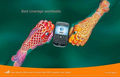
Recently a colleague of mine sent me a link to her favourite advertising campaign of all time. I am very thankful that she shared it with me, as they are absolutely amazing. I can see why these advertisements stood out and were so memorable. After viewing them I would have to say that they are the most artistic creative advertising print campaign I’ve come across yet. Their intricate detail and bright colours make them both eye catching and intriguing.

AT&T‘s “hands” campaign was launched in 2008 in the United States and was created by the advertising agency BBDO (AT&T, 2015, para. 3-4). Each print advertisement features a set of hands painted to represent different countries of the world. Guido Daniele, a famous Italian artist, is responsible for painting the hands in each of the print advertisements (AT&T, 2015, para. 4).


AT&T, advertising, artistic, creative, campaign, hands, art, print, world
(Image Connect, n.d.)


AT&T, advertising, artistic, creative, campaign, hands, art, print, world
(Image Connect, n.d.)


AT&T, advertising, artistic, creative, campaign, hands, art, print, world
(Image Connect, n.d.)


AT&T, advertising, artistic, creative, campaign, hands, art, print, world
(Image Connect, n.d.)


AT&T, advertising, artistic, creative, campaign, hands, art, print, world
(Image Connect, n.d.)


AT&T, advertising, artistic, creative, campaign, hands, art, print, world
(Image Connect, n.d.)


AT&T, advertising, artistic, creative, campaign, hands, art, print, world
(Image Connect, n.d.)


AT&T, advertising, artistic, creative, campaign, hands, art, print, world
(Image Connect, n.d.)


AT&T, advertising, artistic, creative, campaign, hands, art, print, world
(Image Connect, n.d.)


AT&T, advertising, artistic, creative, campaign, hands, art, print, world
(Image Connect, n.d.)


AT&T, advertising, artistic, creative, campaign, hands, art, print, world
(Image Connect, n.d.)


AT&T, advertising, artistic, creative, campaign, hands, art, print, world
(Image Connect, n.d.)


AT&T, advertising, artistic, creative, campaign, hands, art, print, world
(Image Connect, n.d.)


AT&T, advertising, artistic, creative, campaign, hands, art, print, world
(Image Connect, n.d.)


AT&T, advertising, artistic, creative, campaign, hands, art, print, world
(Image Connect, n.d.)


AT&T, advertising, artistic, creative, campaign, hands, art, print, world
(Image Connect, n.d.)


AT&T, advertising, artistic, creative, campaign, hands, art, print, world
(Image Connect, n.d.)


AT&T, advertising, artistic, creative, campaign, hands, art, print, world
(Image Connect, n.d.)


AT&T, advertising, artistic, creative, campaign, hands, art, print, world
(Image Connect, n.d.)


AT&T, advertising, artistic, creative, campaign, hands, art, print, world
(Image Connect, n.d.)


AT&T, advertising, artistic, creative, campaign, hands, art, print, world
(Image Connect, n.d.)


AT&T, advertising, artistic, creative, campaign, hands, art, print, world
(Image Connect, n.d.)


The idea of using hands painted to represent the different countries AT&T’s international wireless service is brilliant. The advertising message is clear and the copy is simple, informative and to the point. The details are so artistic and intricate, I find them to be more like art then advertisements. I could imagine them on display in an art museum. The bright colours chosen for the hand paintings really accentuate the imagery, making them stand out.

In most of the advertisements I find the imagery overpowers the product. Although there is an AT&T cellphone in each advertisement and in the majority of the advertisements it is placed in the centre of the advertisement, the surrounding imagery of the painted hands is the first thing I see when I view them. The more I look at them, the easier it is to forget the paintings are made on actual human hands. It incredible to think that our hands can be shaped to form so many recognizable shapes and images.

Do you think the AT&T “Hands” print advertisements are creative? Which of the twenty-two AT&T “Hands” campaign print ads are your favourite?


References:

AT&T. (2015). AT&T “Hands” Advertising Campaign Voted “America’s Favorite Magazine Ad” by Consumers. Retrieved from http://www.att.com/gen/press-room?pid=4800&cdvn=news&newsarticleid=26908

Image Connect. (n.d.). AT&T Hands Campaign [Image]. Retrieved from http://www.promotional-product-solutions.com/ATT_Hands_Ads.html